Customer Segmentation
I still remember my first professional customer segmentation piece. It was early 2018, I received a CSV file from a luxury London perfume brand, did some cleaning, elbow curve analysis, ran K-Means, and called it a day. The analyst wrote to me that week that it was the ‘best customer segmentation he had ever seen’. Then I spoke to the tech advisor, and he asked me to ‘at least use t-SNE and Gaussian mixtures’.
I’ve done a lot of Machine Learning work since then, but customer segmentation is still a big important part of Data Science. So here’s a business-realistic commented recipe for a segmentation piece.
NB: future me here, I’ve bundled up a lot of different concepts into this post, don’t think I managed to tell a cohesive story. The notebook I’m providing alongside this post is also not the cleanest, and I’ve done it in a bit of a hurry. See the notebook below:
https://gist.github.com/luksfarris/26477552a4f2f1cc612b9154993ae9c9
Problem Statement
Your marketing team wants to advertise a new product. They have limited budget, so they would like to only target customers who are more likely to engage with that product.
You have a list of customers and their features $C = [c_1, c_2, …, c_n]$ where $c_i$ is a feature vector. Each customer has performed certain transactions within your business $T_c = [t_1^{(c)}, t_2^{(c)}, …, t_k^{(c)}]$ where $t_i$ is also a feature vector, and one of those features is the department the product belonged to.
Assume that you can group transactions by one of their categories, for instance customers buying products from a hardware store, you could realistically group the transactions by department. This would give you the amount of products each customer bought from each department. For instance:
| Customer ID | Dept. A | Dept. B | Dept. C | Dept. D |
|---|---|---|---|---|
| $c_1$ | 5 | 0 | 2 | 0 |
| $c_2$ | 0 | 3 | 0 | 1 |
| $c_3$ | 1 | 0 | 0 | 3 |
If the company wanted to run a promotion on products of Department B, it would make more sense for them to target people more like customer $c_2$, and less like $c_1$ or $c_3$. So we make the expectation that our customers can be divided this way (i.e., are distributed in a certain way) and we run models to maximize said expectation [1].
Clustering
Let’s set up the stage for our coding.
import numpy
from sklearn.datasets import make_classification

seed = 42
numpy.random.seed(seed)

customers = 10_000
features = 8
classes = 10
n_clusters_per_class = 4
You may have realized at this point that this is not a simple clustering problem on $C$. We sort of have target variables that we need to respect. Before we dive into the solution, let’s simulate some data:
transactions, department = make_classification(
    n_samples=customers, n_features=features, n_informative=features, n_redundant=0,
    n_repeated=0, n_classes=classes, n_clusters_per_class=n_clusters_per_class,
    random_state=seed, class_sep=2
)
This will give us 10 features (pretend they are customer features), 10K customers, and a target representing one of 10 departments. Let’s look at how this data looks like:
from pandas import DataFrame
df = DataFrame(transactions, columns=[f"f_{i}" for i in range(features)])
df['y'] = department
print(df.sample(5).round(2).to_markdown(index=False)) # df.sample(5).style.hide(axis="index")
| f_0 | f_1 | f_2 | f_3 | f_4 | f_5 | f_6 | f_7 | y |
|---|---|---|---|---|---|---|---|---|
| -0.59 | 1.43 | 1.48 | 3.48 | -5.67 | 1.35 | 2.9 | -0.51 | 6 |
| -1.29 | 3.51 | 1.36 | 0.76 | -1.1 | 3.34 | 3.85 | -2.17 | 6 |
| 1.21 | 1.16 | -2.34 | -2.98 | 1.23 | 1.61 | 2.1 | -1.74 | 4 |
| -0.96 | 0.78 | -0.38 | -4.45 | 0.45 | -3.13 | -1.71 | 1.38 | 4 |
| -3.36 | -1.83 | 1.81 | -3.5 | 2.15 | 4.97 | -1.21 | -2.86 | 2 |
If we were to naively look at the correlations of this data, we wouldn’t see anything interesting. And so is the case with most real-world data:
import seaborn as sns
cm = sns.light_palette("green", as_cmap=True)
print(df.corr().round(2).to_markdown()) # df.corr().style.background_gradient(cmap=cm)
| f_0 | f_1 | f_2 | f_3 | f_4 | f_5 | f_6 | f_7 | y | |
|---|---|---|---|---|---|---|---|---|---|
| f_0 | 1 | 0.05 | -0.1 | 0.03 | -0.09 | -0.1 | 0.01 | 0.1 | 0.05 |
| f_1 | 0.05 | 1 | 0.14 | -0.16 | 0.02 | 0.01 | 0.1 | -0.13 | -0.2 |
| f_2 | -0.1 | 0.14 | 1 | 0.03 | 0.06 | 0.1 | 0.02 | 0.03 | -0.19 |
| f_3 | 0.03 | -0.16 | 0.03 | 1 | 0.2 | -0.06 | 0.05 | 0.05 | -0.01 |
| f_4 | -0.09 | 0.02 | 0.06 | 0.2 | 1 | -0.05 | 0.1 | -0.07 | -0.11 |
| f_5 | -0.1 | 0.01 | 0.1 | -0.06 | -0.05 | 1 | -0.01 | 0.05 | -0.09 |
| f_6 | 0.01 | 0.1 | 0.02 | 0.05 | 0.1 | -0.01 | 1 | -0.06 | -0.15 |
| f_7 | 0.1 | -0.13 | 0.03 | 0.05 | -0.07 | 0.05 | -0.06 | 1 | 0.06 |
| y | 0.05 | -0.2 | -0.19 | -0.01 | -0.11 | -0.09 | -0.15 | 0.06 | 1 |
No strong correlations with y to be found. So if we were to visualize this 10D data in 2D, we’d see the targets are everywhere:
from sklearn.manifold import TSNE
import seaborn

seaborn.set_theme('paper')
color_palette = 'tab10'

data_2d = TSNE(n_components=2, learning_rate='auto', init='random', random_state=seed, perplexity=3).fit_transform(df.drop(columns=['y']))
df_2d = DataFrame(data_2d, columns=['x', 'y'])
df_2d['c'] = df['y']
df_2d.plot.scatter(x='x',y='y', c='c', colormap=color_palette)
pass
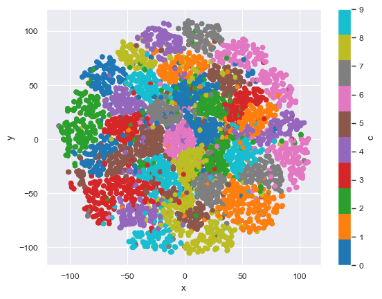
The insight here is that we only want to send the campaign about a specific customer, so we need to prepare our data to be able to understand each department individually. If we were to cluster the data only for a specific department (e.g., Department D) this becomes a much more tractable problem.
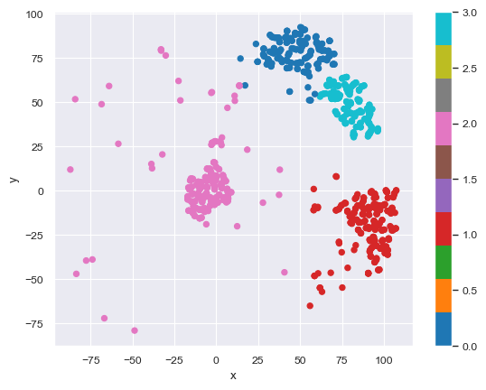
Info
I am simplifying the problem of finding the ideal number of clusters. Since I set up the data with 5 clusters per target, I will use that. But there are good strategies for finding this number, like measuring the silhouette score [2] across different cluster counts.
from sklearn.mixture import GaussianMixture
DEPARTMENT = numpy.random.choice(classes)
X = df_2d.query(f'c == {DEPARTMENT}').drop(columns=['c'])
gm = GaussianMixture(n_components=n_clusters_per_class, covariance_type='spherical', random_state=seed).fit(X)
X.plot.scatter(x='x',y='y', c=gm.predict(X), colormap=color_palette)
pass
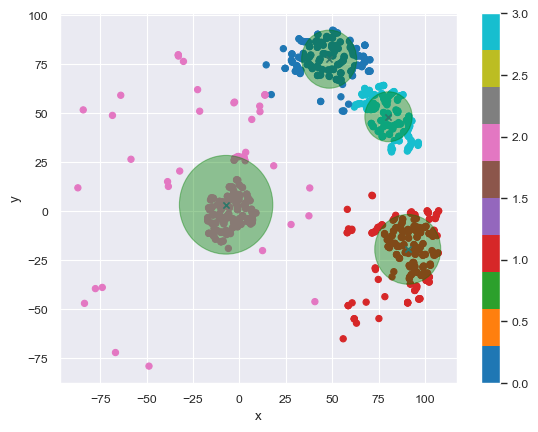
And we can pick the best few clusters to advertise to:
# https://scikit-learn.org/stable/auto_examples/mixture/plot_gmm_covariances.html
import matplotlib
ax = X.plot.scatter(x='x',y='y', c=gm.predict(X), colormap=color_palette)
DataFrame(gm.means_, columns=['x','y']).plot.scatter(x='x',y='y', marker='x', ax=ax)
for n, color in enumerate(['green' for _ in range(n_clusters_per_class)]):
    covariances = numpy.eye(gm.means_.shape[1]) * gm.covariances_[n]
    v, w = numpy.linalg.eigh(covariances)
    u = w[0] / numpy.linalg.norm(w[0])
    angle = numpy.arctan2(u[1], u[0])
    angle = 180 * angle / numpy.pi  # convert to degrees
    v = 2.0 * numpy.sqrt(2.0) * numpy.sqrt(v)
    ell = matplotlib.patches.Ellipse(gm.means_[n, :2], v[0], v[1], angle=180 + angle, color=color)
    ell.set_clip_box(ax.bbox)
    ell.set_alpha(0.4)
    ax.add_artist(ell)
Basically customers “near” the green X marks are suitable to be targeted for the campaign.
Now one would repeat this exercise for every other department, and keep rerunning the clusters often. Let’s see a different approach next.
SHAP
This section took some inspiration from a post by Adam Cooper [4]
So far we’ve found types of customers who purchased from a specific department. But that doesn’t say anything about other products they purchased. What if we wanted to find out what kinds of people are more likely to buy from this department versus others?
For this exercise, we will run a classifier on our data, get Shapley values [3] to “explain” the features, then cluster those values.
We are starting with our previous data, but this time we’ll make it into a binary classification problem and balance the classes.
# adjust target
shap_df = df.copy()
shap_df['y'] = shap_df.y.apply(lambda t: 0 if t != DEPARTMENT else 1)
# balance classes
positives = shap_df[shap_df.y == 1]
negatives = shap_df[shap_df.y == 0]
rows_to_drop = negatives.sample(negatives.shape[0]-positives.shape[0],random_state=seed).index
shap_df = shap_df.drop(rows_to_drop)
print(shap_df.y.value_counts().to_frame().reset_index().to_markdown(index=False)) # shap_df.y.value_counts().to_frame().reset_index().style.hide(axis="index")
| y | count |
|---|---|
| 0 | 1004 |
| 1 | 1004 |
Info
There are many important things to pay attention to here, like better ways of balancing, training the classifier, etc. I will not cover those because that's not the point of the post. Always read on best practices for classification tasks.
Now we will throw a decent classifier at it. Think decision trees for this: Random Forest, XGBoost, LightGBM, etc.
import lightgbm
from sklearn.metrics import confusion_matrix
gbm = lightgbm.LGBMClassifier(verbosity=-1)
X = shap_df.drop(columns=['y'])
y = shap_df.y
gbm.fit(X,y)
y_pred = gbm.predict(X)
print(DataFrame(confusion_matrix(y, y_pred)).to_markdown(index=False)) # DataFrame(confusion_matrix(y, y_pred)).style.background_gradient(cmap=cm).hide(axis="index")
| 0 | 1 | |
|---|---|---|
| 0 | 1004 | 0 |
| 1 | 0 | 1004 |
Don’t worry about the over-fitting here. Now we calculate the Shapley values:
import shap
shap.initjs()
explainer = shap.Explainer(gbm)
shap_values = explainer(X)
shap.plots.force(shap_values.sample(100, random_state=seed))
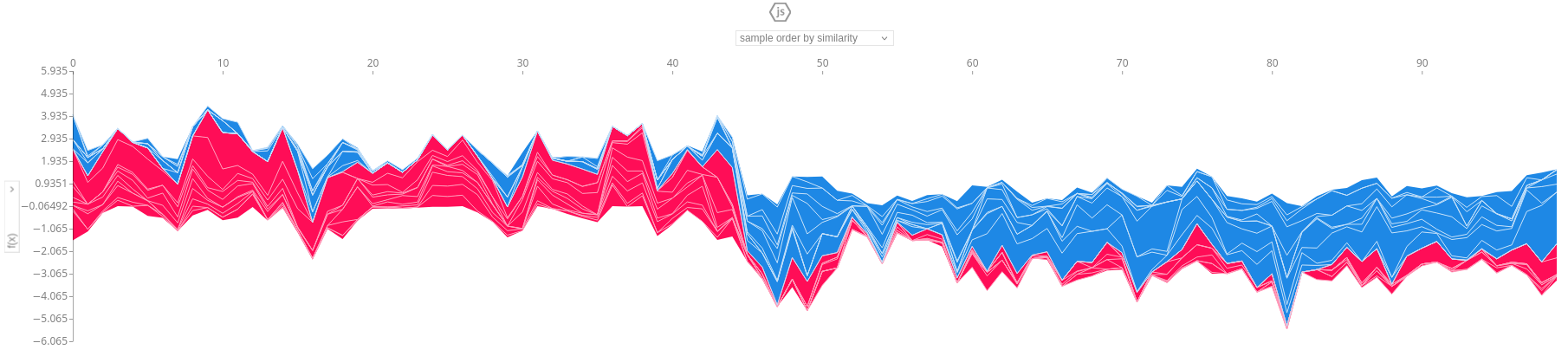
And as you can see we get a detailed view of how each feature influenced 100 random rows of our data. Look at how the left half is mostly one color (i.e., people purchasing from other departments) and the right half is mostly the other color (i.e., people purchasing from our department of interest). Since our dataset is balanced, picking random rows yields a 50/50 split.
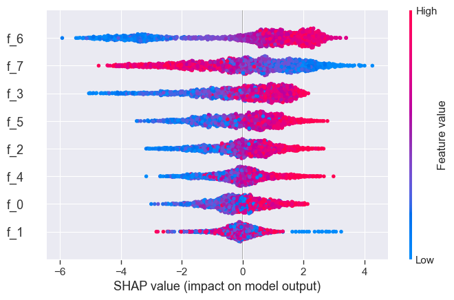
A beeswarm plot gives even more insight into how each feature affects the model:
shap.plots.beeswarm(shap_values)
Now what we want to do is cluster these values. We’ll do the same dimensionality reduction as before, and then cluster the results. We are using UMAP and KMeans this time:
from umap import UMAP
sv_2d = UMAP(
    n_components=2,
    n_neighbors=200,
    min_dist=0,
    random_state=seed,
).fit_transform(shap_values.values[:, :])

from sklearn.cluster import KMeans
kmeans = KMeans(n_clusters=2, random_state=seed, n_init="auto").fit(sv_2d)
y_pred = kmeans.labels_

import matplotlib.pyplot as plt
sv_df = DataFrame(sv_2d, columns=['x', 'y'])
fig, axes = plt.subplots(nrows=1,ncols=2, figsize=(14,5))
sv_df.plot.scatter(x='x',y='y', c=y_pred, colormap=color_palette, ax=axes[0], title="Predicted (cluster)")
sv_df.plot.scatter(x='x',y='y', c=y, colormap=color_palette, ax=axes[1], title="Ground truth")
pass
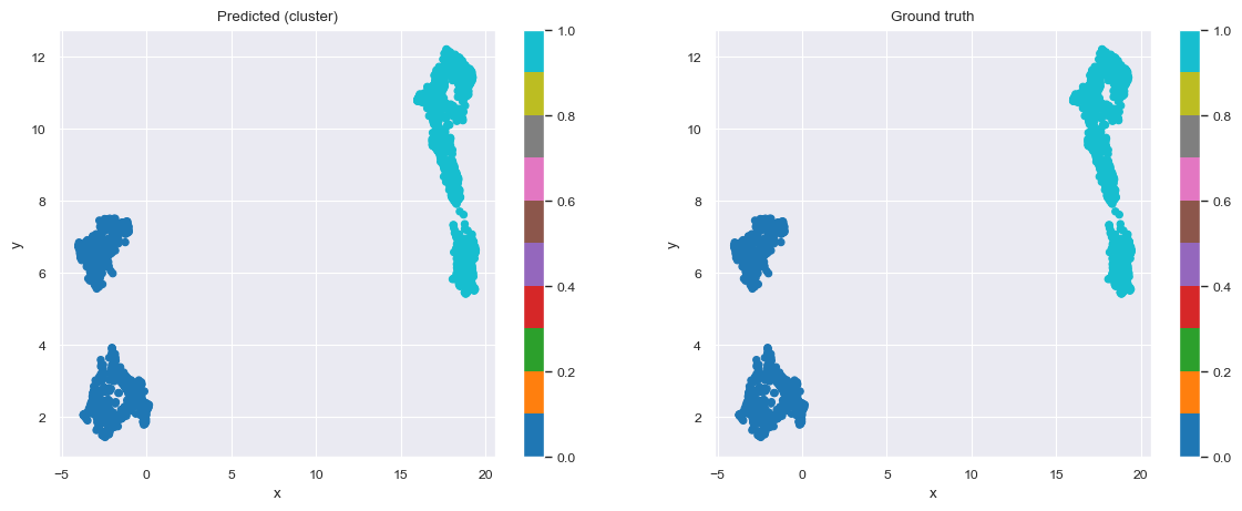
And we get nicely separated clusters. Now, we would just have to find every customer who is “like” customers who purchased from our department of interest (but not in that group), and target them for the campaign. For this, we are going to automatically come up with decision rules.
from imodels import RuleFitRegressor
rulefit = RuleFitRegressor(max_rules=5)
rulefit.fit(X, y_pred)
rulefit

rulefit._get_rules().query("type == 'rule'").sort_values(by='importance', ascending=False)[["rule", "support", "importance"]]
| rule | support | importance |
|---|---|---|
| f_3 > -0.63812 and f_6 > -1.03042 and f_7 <= 1.33218 | 0.419821 | 0.024152 |
| f_3 > -0.93303 and f_6 > -0.3279 and f_7 <= 1.07948 | 0.398406 | 0.023129 |
| f_3 > -0.55268 and f_6 > -1.21305 and f_7 <= 1.25864 | 0.419323 | 0.019905 |
| f_3 > -1.33948 and f_6 > -1.06401 and f_7 <= 1.10573 | 0.440737 | 0.005256 |
With decision rules, we sacrifice some accuracy in our predictions, but we get extremely intuitive rules that can be used and understood by anyone. Here’s the calculation for the exact loss of precision and recall:
from sklearn.metrics import precision_score, recall_score, confusion_matrix
print("Precision:", precision_score(y, rulefit.predict(X).round().astype(int)))
print("Recall:", recall_score(y, rulefit.predict(X).round().astype(int)))
confusion_matrix(y, rulefit.predict(X).round().astype(int))
Precision: 0.84 - Recall: 0.70
| 0 | 1 | |
|---|---|---|
| 0 | 868 | 136 |
| 1 | 302 | 702 |
References
[1] Expectation Maximization algorithm on Wikipedia
[2] Silhouette score on Wikipedia
[3] A Unified Approach to Interpreting Model Predictions
[4] Supervised Clustering: How to Use SHAP Values for Better Cluster Analysis